
Monday morning starts the same way in too many independent cafés, salons, and gyms. The till is closed, the laptop opens, and a dashboard full of numbers appears, yet the one question still hanging in the air is simple, who is coming back next week?
That gap is why most generic analytics tutorial content feels useful for ten minutes and then gets ignored. It teaches charts, terms, and interface clicks, but it rarely teaches a manager how to decide whether to send a comeback coupon, change a reward, or stop wasting time on the wrong customers. Good loyalty analytics should answer the operational questions that matter before lunch, not just produce a prettier report.
The Monday Morning Numbers Problem
A shop owner rarely needs more data on Monday. They need fewer, sharper answers. A café manager opening three tabs of sales reports, loyalty charts, and social insights usually still doesn't know whether the regulars are fading, whether the latest stamp offer worked, or which customers deserve a nudge today.
That is where most dashboards fail. They show totals, averages, and broad engagement patterns, but those numbers don't automatically tell a person what to do next. A loyalty dashboard should behave more like a short action list, not a museum wall.
What a useful loyalty view actually says
A practical view should surface three things at a glance. First, who came back. Second, who is slipping away. Third, what offer or message produced a measurable reaction. If those three answers are missing, the dashboard is ornamental.
The difference matters because loyalty analytics isn't the same job as sales reporting. Sales tells the owner what happened at the till. Loyalty tells the owner which customers are building a habit and which ones are breaking it.
Practical rule: If a report does not change a decision, it is not an operating report, it is decoration.
That is also why teams looking for cleaner reporting often look for guidance on how to build dashboards that drive decisions. The useful pattern is always the same, start with the decision, then build the view around it.
Why loyalty deserves its own routine
A lot of owners glance at Google Analytics, then assume they have done the analytics work. They haven't, not for a physical shop. Website traffic may show interest, but a neighbourhood café or salon lives and dies on repeat behaviour, visit spacing, and offer response.
The weekly ritual should be different. On Monday, a shop owner should look for a short list of customers to reactivate, one campaign result worth keeping, and one change to test next week. That routine is far more valuable than an hour spent staring at charts that never connect back to customer visits.
Set the Goals Before You Set the Tools
A loyalty setup gets messy fast when the owner starts with features instead of targets. The right order is simple, define the business goal, translate it into a retention goal, then turn that into a behaviour goal the team can check every week. That sequence is also where a clean analytics tutorial becomes useful, because metrics stop being abstract and start serving a decision.
A one-page goal sheet beats a long wish list
The goal sheet does not need to be fancy. It needs to be specific enough that staff can tell whether the week was good or bad.
Start with one revenue goal. For a café, that could be the share of weekly revenue coming from loyalty members. For a salon, the better question is whether active customers are booking often enough to stay in a stable cycle. For a gym, the important test is how quickly dormant members are brought back after they stop attending.
Then add one retention goal. That might be repeat visits, reactivation, or offer redemption. Finally, add one behavioural goal, such as stamping frequency, coupon use, or sign-up completion. Each goal should map to a metric the team can check every Monday without a meeting.
Match the goal to the right metric
A coffee shop and a gym can use the same platform and still need very different dashboards. That's normal. A shop with fast repeat cycles cares about visit cadence. A salon cares about renewal rhythm. A gym cares about returning after lapse.
Use the table as a working template.
| Goal type | Example | Weekly metric |
|---|---|---|
| Revenue goal | More loyalty-led sales in the café | Loyalty member revenue mix |
| Retention goal | Keep regulars from drifting away | Repeat visit rate |
| Behaviour goal | Get more customers to use the offer | Coupon redemption rate |
For merchants comparing setup options, the plan costs page is useful as a practical checkpoint before they print a single QR code. Price matters, but the goal sheet should still come first.
A simple rule helps here. If the goal can't be checked weekly, it is probably too vague. If it can't trigger an action, it is probably the wrong metric.
Configure Tracking in BonusQR the Right Way
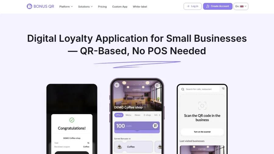
A good setup starts with the reward mechanic, not the screen layout. Stamps make sense when the business wants repeat visits. Points work better when the owner wants flexibility. Cashback, spend thresholds, fixed discounts, birthday offers, and seasonal rewards all push behaviour in different ways, so the first choice should match the goal sheet, not the trend of the week.
Configure the signals before launch
The platform should record the events that matter later. That means deciding what gets logged at sign-up, what gets logged at each scan, and which fields will help segment customers by behaviour. If visit cadence is important, it has to be part of the setup from the start.
No POS overhaul is required for this kind of workflow. Staff scan within the app, customers keep the offer in Google Wallet or Apple Wallet, and the business gets a cleaner first-party record of visits and redemptions than it would from casual manual tracking. That is important because privacy-safe, first-party measurement is easier to defend than broad tracking that tries to know too much.
The UK compliance side matters too. The ICO says organisations need a lawful basis under UK GDPR, and direct marketing can also fall under PECR, which can require consent in many cases. A loyalty programme in the UK has to be designed with both in mind, not just with marketing convenience.
What to verify before going live
Before launch, the owner should check a short punchlist:
- Reward mechanic: The chosen mechanic matches the business goal, not just the nicest-looking option.
- Tracked fields: Visit count, redemption, and customer status are captured consistently.
- Wallet passes: Customers can store the offer in a place they'll revisit.
- Segment tags: The system can later separate new joiners, regulars, and lapsed customers.
- Refresh rhythm: Staff know when the data updates and when a stale record should be ignored.
That last point saves a lot of confusion. A dashboard built on half-updated data produces bad decisions with a confident interface. Clean, scheduled data beats noisy real-time excitement in a small shop.
The Four Metrics That Actually Matter
Owners don't need twenty charts. They need four numbers they can learn to read cold. Visits, top customers, coupon performance, and customer lifetime value are the headline metrics that show whether the loyalty engine is creating habit or just moving numbers around.
Visits and top customers tell different stories
Visits show activity, but the raw count can mislead. A higher visit number is not automatically better if the same people are not returning more often, or if lighter buyers are crowding out the right segment. Top customers show concentration, which is useful because it tells the owner who really drives repeat business.
A rising visit count with a flat top-customer list usually signals an acquisition problem rather than a loyalty win. The shop is getting traffic, but the best customers are not deepening their relationship. That's where a simple scan-based programme can tell the truth faster than a monthly sales review.
Coupon performance can hide weak economics
Coupon performance looks strong when customers redeem. That is not the same as profitable behaviour. A coupon that gets used easily but doesn't improve long-term value may just be teaching people to wait for discounts.
That is why coupon performance needs to be read next to customer value, not alone. If redemptions climb but repeat quality stays flat, the offer is probably attracting deal-hunters rather than regulars.
Customer lifetime value is the long view
Customer lifetime value helps the owner stop judging the week in isolation. A single noisy Friday doesn't matter much if the underlying customer relationship is improving. The mistake is treating every spike as success and every dip as failure.
The BonusQR analytics dashboard is designed around this kind of reading. It surfaces the numbers that show whether loyalty is building repeat behaviour, not just creating activity.
| Metric | What it tells you | Action it triggers |
|---|---|---|
| Visits | How often customers come back | Check cadence and campaign timing |
| Top customers | Which people drive the most value | Protect and reward the best segment |
| Coupon performance | Which offers people actually use | Keep winners, drop weak promos |
| Customer lifetime value | Whether loyalty is compounding | Invest in retention, not just acquisition |
A metric earns its place only when it changes the next message, the next reward, or the next offer.
Build a Weekly Report You Will Actually Read
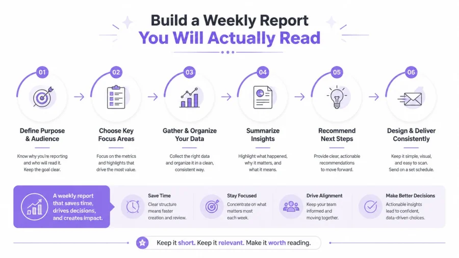
A report gets used when it is short enough to finish on a Monday morning without excuses. The best weekly report has three parts, a one-line summary, the four headline metrics, and a small list of customers or cohorts that need attention. Anything larger usually turns into a file that gets opened once and forgotten.
Read week-on-week movement, not just totals
The useful habit is comparing last week to the week before, not staring at the absolute numbers in isolation. Absolute totals can look healthy while the trend weakens. That is how slipping behaviour hides inside otherwise decent dashboards.
A café running a weekly stamp promotion should keep the report brutally simple. One line can say whether redemptions rose, whether repeat visits held steady, and whether any regulars stopped showing up. If there was an unusual spike, the owner should note it, but not treat it as proof of a lasting shift.
A clean report template for a small shop
A repeatable weekly report can fit on one screen or one page:
- Week summary: One sentence on what changed.
- Four metrics: Visits, top customers, coupon performance, and customer lifetime value.
- Attention list: The customers or cohorts that need a follow-up.
- One action: The single test or change for next week.
That format avoids the classic problem of a beautiful dashboard no one checks. It also keeps the owner from overreacting to a single bad day.
Practical rule: If the report takes more than fifteen minutes to prepare, it will not survive a busy week.
The same discipline shows up in analytics guidance more broadly, which is why many operators borrow the same reporting logic used in broader measurement systems, then strip it down to the few items they'll actually read. The point is not to admire the data. The point is to decide whether a customer deserves another message.
Segment Customers by Behaviour, Not Demographics
Age, postcode, and broad persona labels are usually too blunt for a shop-level loyalty programme. Behaviour tells the better story. A customer who visits every week, then pauses, is not the same as a customer who never formed the habit in the first place.
Use simple behavioural buckets
The strongest segments are usually the most obvious ones:
- New joiners: Customers who have just signed up and need a welcome nudge.
- Regulars: People who already show strong visit cadence.
- Slipping regulars: Customers who used to visit, then missed the expected return window.
- Dormant customers: People who haven't come back for longer than the usual cycle.
- Lapsed customers: Customers who are far enough out that a stronger reactivation offer is justified.
A coffee shop can treat slipping regulars as those who have been absent for around 30 days. A salon may stretch that window to around 45 days because the natural cadence is slower. Those thresholds are practical, not sacred, and they should always match the business rhythm.
Match the offer to the segment
A generic blast to everyone usually underperforms a tight message to a defined group. New joiners need a welcome bonus. Regulars respond better to recognition than to loud discounts. Dormant customers often need a simple “we miss you” message with a reason to return.
The customer segment tools page is a useful reference point for merchants who want to keep the segmentation logic inside one place instead of spreading it across spreadsheets and messaging tools. The important thing is the behaviour, not the label.
A short reactivation push can do more than a broad promotion because it respects context. The same offer sent to an active regular and a dormant customer should not look identical. They are in different moments, so they need different nudges.
Run Experiments and Automate the Responses
A loyalty programme becomes far more useful once the owner starts treating it like a small testing lab. The aim isn't to guess which coupon sounds nicest. The aim is to change one variable, hold the rest steady, and see whether customer behaviour moves.
A/B tests need one clean difference
A proper coupon test changes a single thing. That might be the discount amount, the wording, the reward timing, or the expiry window. If several variables change at once, the result turns messy and the owner can't tell what caused the response.
Small shops also need to respect sample noise. A noisy week doesn't prove a strategy works or fails. The safer move is to run the test for a defined window, then compare the segment response against the baseline from the week before.
Automation should follow behaviour, not calendar clutter
The strongest automations usually sit close to the customer lifecycle. A welcome bonus can trigger the day after sign-up. A comeback offer can trigger after a period of inactivity. A birthday coupon can fire on the date itself. These are simple, timely, and easy to understand.
That is also where first-party data becomes more valuable than broad ad-tech style tracking. UK businesses are under more privacy pressure, third-party cookies are being phased out in Chrome, and lightweight consent-based measurement is becoming the safer long-term choice. Clean first-party loyalty data, such as sign-up source, visit cadence, redemption rate, and reactivation response, tends to be easier to act on anyway.
The cleanest automation rule is the one staff can explain to a customer without reading a manual.
A 30-day operating rhythm
A simple month is enough to get started:
- Week 1: Review the four headline metrics and set the baseline.
- Week 2: Pick one behavioural segment and send one targeted campaign.
- Week 3: Run one A/B test on a coupon or message.
- Week 4: Review the result, keep the winner, and choose the next hypothesis.
The most common mistakes are predictable. Owners chase new customers while retention is already weak. They overreact to a single bad week. They ignore privacy hygiene and then have to redo the setup later. The better pattern is steadier, simpler, and easier to maintain.
BonusQR is one workable option for that kind of setup because it does not require POS integration or extra hardware, and it lets a merchant launch a QR-based loyalty flow quickly, with a free start and the option to move into a white-label app later. The core value is not the interface. It is that a small team can measure repeat visits, reactivate customers, and test offers without turning the shop into a data project.
A better loyalty system does not need more reports. It needs a tighter loop between customer behaviour, staff action, and the next offer. Start with one goal, one segment, and one weekly review, then build from there. If the current dashboard still can't answer who is slipping, who came back, and which offer worked, set up a simple QR loyalty flow and begin tracking those three questions this week.


