
 Deutsch
 Español
 Français
 Italiano
 Magyar
 Polski
 Slovenčina
 Čeština
Cohort analysis reveals when and why customers stop returning and shows the precise moments to act to improve loyalty. By grouping customers who joined, bought, or signed up around the same time, you can watch retention unfold period by period and spot exactly where it weakens. The first step is simple: open your cohort heatmap or export your acquisition-date cohorts and look for the row where numbers start dropping faster than the rest.
TL;DR:
- Start with acquisition cohorts based on registration or first purchase dates; keep cadence and customer identifiers consistent before adding behavioral or predictive segments.
- Track retention by elapsed week or month alongside repeat purchases, frequency, and cohort revenue; fixed churn cutoffs can misclassify customers with longer buying cycles.
- Annotate campaign and product change dates on retention charts; compare cohorts at the same elapsed periods to distinguish lasting gains from seasonal spikes.
- Test one change on a new cohort while a comparable cohort keeps the existing approach, then wait at least two observation periods before judging results.
What is loyalty cohort analysis and when to use it
A loyalty cohort is a group of customers who share a starting point, usually a first purchase date, sign-up date, or first use of a reward. Cohort analysis tracks how that group behaves over the weeks or months that follow, rather than looking at your customer base as one blended average. This distinction matters because an overall retention number can hide what is actually happening underneath it.
You turn to cohorts for loyalty work because they answer three practical questions that averages cannot:
- Did a specific campaign or promotion attract customers who stick around, or ones who redeem once and disappear?
- Is a new onboarding flow helping or hurting early retention compared with the flow it replaced?
- Which acquisition channel brings in customers with genuinely higher lifetime value, not just a lower cost per sign-up?
Averages blend your best and worst customers into one misleading figure. Cohort analysis exposes the differences between groups by comparing acquisition-source cohorts on the same elapsed-time scale, which lets you see newer customers leaving faster even while the overall average still looks healthy because older cohorts are propping it up. For loyalty programmes specifically, this means you can tell whether a points scheme launched three months ago is actually working, or whether early enthusiasm is simply masking a steady decline.
Use cohort analysis whenever you need to isolate the effect of a change: a new reward tier, a revised welcome offer, a different acquisition channel, or a redesigned app experience. Use simple aggregate metrics only for a quick pulse check, not for detailed diagnosis.
Types of cohorts to use for loyalty work
Not every cohort answers the same question, so choosing the right type matters as much as building the analysis correctly.
- Acquisition cohorts, grouped by sign-up or first-purchase date, are the backbone of loyalty measurement. They let you compare, month over month, whether customers who joined during a particular promotion or season stay engaged longer than those who joined at other times.
- Behavioural cohorts group customers by their first meaningful action rather than a calendar date, such as redeeming a welcome reward, reaching a points threshold, or completing a referral. These cohorts are useful when the triggering event, not the sign-up date, is what predicts future loyalty.
- Product or channel cohorts segment customers by the item they first bought or the channel that brought them in, such as a paid advert, an organic search, or an in-store sign-up. Cohort analysis grouped by shared characteristics like these helps you decide where to put marketing budget and which product lines actually build repeat custom.
- Predictive cohorts, built from propensity scores, group customers by their likelihood of churning or re-engaging based on early behaviour patterns. These are the most forward-looking type, letting you intervene before a customer actually lapses rather than reacting after the fact.
Acquisition cohorts are the right starting point for most small and medium-sized businesses, since they require only a sign-up date and a repeat-purchase or redemption record. Behavioural and product cohorts become valuable once you have enough volume to split acquisition cohorts further without the groups becoming too small to read reliably. Predictive cohorts are worth building once you have a clear retention baseline and want to move from describing churn to anticipating it.
Key metrics to track inside cohorts
Once your cohorts are defined, the numbers inside them need to answer specific loyalty questions, not just describe activity.
Retention rate by elapsed period is the core measurement: the percentage of a cohort still active, purchasing, or redeeming at each interval after their start date. Choose day, week, or month depending on how often customers normally interact with you; a daily cadence suits a café loyalty scheme, while a monthly cadence suits a once-a-season retailer.
Churn is simply the inverse of retention, but fixed-window churn rules (such as “inactive for 30 days means churned”) can misclassify customers whose natural buying cycle is longer than the window you picked, flagging perfectly loyal customers as lost.
Beyond retention and churn, track:
- Repeat purchase rate, the share of a cohort that buys more than once within your chosen window.
- Purchase frequency, how often an active customer returns, which tells you whether loyalty is deepening or merely holding steady.
- ARPU and cohort CLV, which translate retention into revenue and let you compare the profitability of different acquisition cohorts directly.
Statistic: Comparing acquisition-source cohorts on the same elapsed-month retention curve is how practitioners catch newer cohorts leaving faster even while the blended average still looks stable, which is exactly the kind of early warning a loyalty programme needs before churn becomes visible in the top-line numbers.
Payback period and acquisition efficiency close the loop between marketing spend and loyalty outcomes: if a channel’s cohorts take longer to become profitable, that channel may be bringing in volume rather than loyalty.
How to run a cohort analysis step by step
Building a usable cohort analysis is mostly a matter of discipline around data and definitions, not advanced tooling.
- Pick the right start event. Decide whether your cohort begins at sign-up, first purchase, or first reward redemption, and make sure every customer record uses a stable, unique identifier so the same person is not split across two IDs.
- Set your cohort cadence. Group customers by week or month depending on your sales cycle, and keep that cadence consistent across every cohort you compare.
- Choose your observation window. Decide how many periods forward you will track (12 weeks, six months, a year) and align every cohort’s “period 1”, “period 2” and so on from its own start date, not from the calendar date.
- Pull the data. Export purchase or redemption events with customer ID, event date, and cohort start date into a spreadsheet or your analytics tool.
- Build the heatmap. Put cohort start dates down the rows and elapsed periods across the columns, with retention percentage in each cell; colour-code so weak cells stand out immediately.
- Plot the cohort curves. Overlay several cohorts’ retention percentages on a single line chart to see whether newer cohorts are outperforming or lagging older ones.
- Annotate everything. Mark the exact dates of campaigns, onboarding changes, and reward launches directly on the chart so a retention break can be matched to a real event rather than guessed at.
A cohort heatmap is the most common output precisely because it makes the first meaningful drop and any long tail of decline visible at a glance, which is what turns a spreadsheet of numbers into an action list.
Pro Tip: Keep a simple annotation log next to your cohort chart, noting the date and nature of every product, pricing, or campaign change, so that a retention break six months from now still has an obvious explanation attached to it.
A few setup mistakes are worth guarding against from the start: cohorts that are too small to produce stable percentages, inconsistent definitions of “active” between periods, and comparing cohorts across different cadences (weekly against monthly) without converting them to the same scale first.
Interpreting cohort charts: patterns, diagnoses and next steps
A cohort chart only becomes useful once you can read its shape and match it to a likely cause.
- A sharp early drop-off in the first one or two periods usually points to an onboarding problem. Test this with three quick experiments: simplify the welcome flow, send a reminder nudge within 48 hours of sign-up, or offer a small reward for the first completed action rather than just for joining.
- Diverging channel cohorts, where paid-acquisition customers retain worse than organic ones on the same elapsed-time scale, signal that it is time to re-evaluate ad spend or targeting rather than assuming all new customers are equally valuable.
- Seasonal spikes that appear in every cohort around the same calendar month are a calendar effect, not a durable improvement; separate these from genuine gains by comparing the same elapsed period across several cohorts rather than reading a single peak in isolation.
- A genuine, lasting improvement shows up as a sustained lift that holds across multiple consecutive periods for cohorts that started after a specific change, not just a one-off bump right after launch.
Annotating cohort charts with campaign and product-release dates is what separates a confident diagnosis from a guess, since correlations between a chart’s shape and a nearby event are easy to misread without that record. To confirm whether a change actually created durable loyalty, compare the cohort that experienced the change against the cohort immediately before it, then check whether the next cohort after the change holds the same gain rather than reverting.
Turning cohort signals into loyalty programme actions
Once a cohort chart has pointed you to a problem, the next step is a specific, testable change rather than a broad new initiative.
- Time your rewards around the dropout window. If cohorts consistently fall away around week three, move a milestone reward or bonus points trigger to arrive just before that point.
- Segment your messaging by cohort behaviour. Customers who redeemed a welcome offer but never returned need a different message from those who are three purchases in and slowing down.
- Fix the product or fulfilment issue the cohort evidence points to. A drop-off that lines up with a shipping delay or a confusing app step is a cue for an operational fix, not just a marketing one.
- Design cohort-aware A/B tests. Run the change on a new cohort while a comparable cohort continues under the old approach, then compare both on the same elapsed-time scale rather than on calendar dates.
Pro Tip: When testing a new reward structure, launch it only for new cohorts and leave existing cohorts untouched, so you can compare like with like instead of mixing old and new customer behaviour in the same chart.
Measuring outcomes properly means waiting for at least two full observation periods before declaring success, since a one-period bump is often enthusiasm rather than durable loyalty.
Survival-analysis nuance for loyalty cohorts
Fixed cutoffs like “30 days without a purchase means churned” work poorly for businesses with irregular repeat cycles, such as a furniture shop or a seasonal gift retailer, because they misclassify customers who are simply between normal purchase occasions.
Survival analysis treats churn as a time-to-event problem rather than a yes-or-no state: a customer who has not yet repurchased by the end of your observation window is “right-censored”, meaning they have not necessarily churned, just not yet had the chance to show up again. Kaplan-Meier estimators and similar time-to-next-purchase models account for this censoring directly, which reduces the bias that fixed windows introduce.
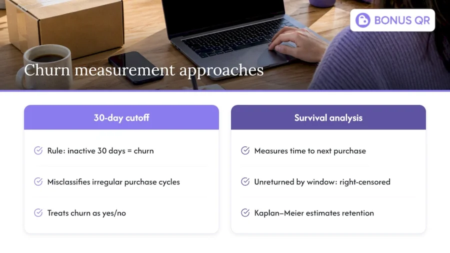
In practice, you do not need to abandon your cohort heatmap to use this. Run a survival model alongside it to estimate the typical time-to-next-purchase distribution for your business, then set your cohort observation windows and churn definitions to match that real cadence rather than an arbitrary 30 or 90 days. When cohort sizes are small, compute a confidence interval around each retention percentage before treating any single cell as a signal, since noisy small-sample cells are easy to mistake for real breaks.
What I have learned from working through loyalty cohorts
The single biggest mistake I see is businesses building an elaborate cohort dashboard before they have tested whether cohorts change anything about what they do. Start smaller: pick one cohort, one metric (usually week-four retention), and two weeks of disciplined annotation of every product or campaign change you make. That alone tells you more than a polished report nobody acts on.
Cohort analysis rewards patience and repetition more than sophistication. The value is not in the first chart, it is in the fourth one, once you have enough comparable cohorts to tell a real pattern from noise. Treat every reward change, every onboarding tweak, as a question you are asking the next cohort to answer, and keep the annotation habit going long after the first insight feels obvious.
— Michal
How a loyalty platform supports cohort-driven retention work
Running the kind of cohort-informed tactics this guide describes, timed rewards, segmented offers, and fast follow-up experiments, is far easier when your loyalty platform already tracks the data a cohort analysis needs.
- Segment-targeted rewards let you aim a specific offer at the exact cohort or behavioural group a chart has flagged, rather than sending the same promotion to everyone.
- Automated marketing campaigns can trigger the moment a cohort shows early signs of drifting, such as a milestone nudge timed just before your typical dropout window.
- Real-time analytics dashboards give you the retention and redemption data a cohort chart is built from, without exporting and reassembling spreadsheets by hand.
We built our platform around exactly this kind of flexibility: customisable points, stamp cards, tiered cashback, and automated campaigns that you can configure around the cohort patterns you find. You can see current plan details, including our Free, Basic, and Premium tiers, or look at our white-label app options if your business needs a fully branded loyalty app. For businesses wanting a bespoke build, our custom app development service covers the setup and ongoing maintenance. If cohort analysis has shown you where your loyalty programme is losing people, the fastest next step is to check which plan fits your business and start testing a fix.
FAQ
Can you give me an example of a cohort analysis?
A typical example groups customers by the month they first joined a loyalty programme, then tracks what percentage of each monthly group is still redeeming rewards one, three, and six months later. Plotting these groups on a cohort heatmap often reveals that customers acquired during a discount-heavy promotion retain worse over time than those acquired through a referral programme, even if both groups looked similar at sign-up.
What are the four C’s of customer loyalty?
Definitions of the “four C’s” vary across marketing sources, but a common version covers consistency, communication, convenience, and care, the idea being that loyalty is built through reliable experiences, regular and relevant contact, ease of use, and genuine attentiveness to customer needs. These are useful principles to test against your cohort data, since a drop in any one of them tends to show up as an early retention break.
What are the 5 pillars of brand loyalty?
Framings of brand loyalty “pillars” differ by source, but they generally cluster around trust, consistent value, emotional connection, convenience, and recognition or rewards. Cohort analysis is one of the practical ways to check whether these pillars are actually holding, since a weakening in trust or value usually appears as a slower retention curve for recent cohorts compared with older ones.
What is cohort analysis?
Cohort analysis groups customers who share a starting point, such as a sign-up date, and tracks their behaviour over the weeks or months that follow rather than looking at the customer base as a single blended average. This method groups customers by shared characteristics and compares them on the same elapsed-time scale, which is what makes it possible to spot retention breaks that an overall average would hide.