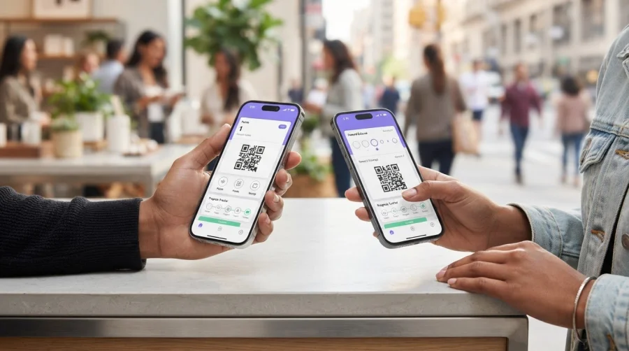
What makes a digital wallet pass effective isn’t necessarily the boldest design. The best digital wallet pass design best practices start with a clear reward, readable details, and an obvious next step. On a small screen, too much information or a design that ignores Apple Wallet and Google Wallet conventions can make a pass harder to recognize and use.
It’s understandable to want a pass that reflects your brand and stands out. Visual polish works best when it supports the pass’s purpose. Customers should quickly see what they’ve earned, how to use it, and where to look next.
This guide shows you how to balance brand identity with platform-specific design, organize information for quick scanning, and make the core action easy to find. You’ll also see how clear digital stamp card and points pass design can support a more effective loyalty experience, including with wallet-connected options like BonusQR.
Key Takeaways
- Give your pass a clear visual order so customers can spot the brand, reward or balance, and progress quickly.
- Use familiar, concise labels to make stamps, points, and redemption steps easy to understand.
- Apply digital wallet pass design best practices across Apple Wallet and Google Wallet, and check each platform’s current official requirements.
- Before launch, preview the pass, test scanning and updates, and see whether a first-time customer can identify the reward and next action.
- Choose pass details that fit your loyalty mechanic: add context where it helps, but keep the layout focused for quick scanning.
What Makes Digital Wallet Pass Design Work for Loyalty?
A loyalty pass has a small screen and a simple job: help customers recognize your business, understand their reward, and know what to do next. It’s a mobile wallet item that presents useful loyalty or membership information, such as stamp progress or a points balance. As part of a digital wallet, it gives customers convenient access to key details without needing to include every program feature.
Effective digital wallet pass design prioritizes brand recognition, reward clarity, and usability so customers can understand the pass and act on it at a glance. That balance matters. A hard-to-recognize logo weakens the connection to your business. A reward buried under extra details creates friction. A clear design makes the benefit easy to grasp and the next step easy to follow.
What should a loyalty wallet pass communicate first?
Arrange information in the order customers need it. Start with a recognizable brand identifier, then make the reward type and progress easy to find. A digital stamp card might show how many stamps a customer has collected; a points pass might highlight the available balance. Use familiar, concise labels. Then show the next useful action, such as presenting or scanning the pass to collect progress or redeem a reward.
Think of the pass as a quick customer prompt, not a space to explain every program rule. If customers have to search for what they’ve earned or what to do next, the information hierarchy needs work. Put the customer’s immediate question first: “What’s my reward, and how do I use it?”
How is a wallet pass different from a loyalty app?
A wallet pass is a compact touchpoint for essential loyalty information. A full loyalty app or another digital experience can support broader account features, while the pass keeps useful details close at hand. It doesn’t need to replace every app function. Its job is to make the core loyalty interaction straightforward.
Apple Wallet and Google Wallet are separate destinations, each with its own presentation rules. Design with both platforms in mind instead of assuming one layout will look identical in each. A loyalty platform such as BonusQR connects digital stamp cards and points systems with Apple and Google Wallet, giving businesses a practical foundation for wallet-based loyalty.
Build a Clear Visual Hierarchy for Digital Wallet Passes
Customers should understand the main reward before reading the fine print. Build the pass in this order: brand, reward or balance, progress, then supporting information. This gives each element a clear job and keeps terms, help details, and secondary messages from competing with the loyalty benefit.
Design principle: the primary reward should make sense without customers needing to read secondary details. Use short, familiar labels such as “Stamps,” “Points,” and “Reward,” and explain redemption with direct language like “Show this pass to redeem.” Avoid internal program terms customers may not recognize.
Which information belongs on the front of a loyalty pass?
Give the most space and visual emphasis to what customers need to identify and use their loyalty benefit. For example, a stamp card could show your business name, “Coffee stamps,” and “4 of 8 stamps,” with a brief redemption prompt. A points pass might lead with your brand, “Points balance,” and the current balance. Keep extra terms or support messages secondary so they remain available without pulling attention from the reward.
How should colour, typography, and imagery work together?
Choose a compact palette that fits your brand and keeps text distinct from its background. Use clear type that remains legible at small sizes. Decorative fonts, tight spacing, and long labels can make key details harder to read. A logo or image should strengthen recognition, not squeeze out the reward or progress. Apple’s Apple Human Interface Guidelines for Wallet provide platform-specific design guidance to consider as you refine the layout.
Use spacing to separate information into easy-to-scan groups, and reserve stronger contrast for the reward and progress. Keep colour meaningful but restrained. Don’t rely on colour alone to show status: pair it with a number, label, or another clear indicator. For example, display “4 of 8 stamps” rather than using a colour change as the only sign of progress.
These choices help a pass feel on-brand without turning it into a miniature advertisement. If you’re shaping a loyalty experience around a digital stamp card or points system, explore a wallet-connected loyalty setup with BonusQR.
Design for Apple Wallet and Google Wallet Without Guesswork
A pass can carry the same loyalty message in both wallets without appearing exactly the same. Apple Wallet and Google Wallet have distinct presentation rules, so treat each as its own destination. Keep the customer-facing message consistent while checking how each platform displays it.
Separate the choices your business controls from the implementation details shaped by the wallet. You control the brand assets, wording, reward information, and visual direction. Each platform has its own requirements for supported fields and pass presentation. Check current official Apple Wallet and Google Wallet documentation before implementation, and don’t assume one set of design specifications applies to both.
| Shared design principles | Platform-specific details to verify |
|---|---|
| Keep the brand identity, reward message, and customer-facing terms consistent. | Check each wallet’s current rules for pass structure, supported content, and assets. |
| Make essential loyalty information readable, with clear contrast on a mobile display. | Review how each wallet renders text, logos, colours, and other submitted elements. |
| Make the pass’s purpose clear without promising identical layouts. | Confirm that required fields and customer information appear as intended in that wallet. |
What design principles apply across both wallets?
Keep the customer promise steady. If a pass represents a points program, use the same reward language and explain points consistently in both destinations. Check readability on an actual phone, not only in a desktop design file. Small text, weak contrast, or crowded details can be harder to notice on a mobile screen. Aim for a familiar experience, not a pixel-for-pixel match.
What should teams test separately in each wallet?
Preview the implemented pass in Apple Wallet and Google Wallet using the current supported preview and testing options. Review each version on a mobile device. Check that the logo displays cleanly, colours remain legible, text isn’t cut off, and essential loyalty information is easy to find. A design that looks balanced in one wallet may need adjustment in the other.
Test the live pass experience, too. Confirm that customer-facing details and updates appear as expected after implementation. For a digital stamp card, review how stamp progress is presented; for a points pass, check that the points information is clear. This catches issues a static mock-up can miss. BonusQR’s loyalty platform connects a program with both Apple and Google Wallet, and each destination should still get its own review before customers use it.
Test Digital Wallet Pass Design Before Customers Use It
A pass can look polished in a design file and still confuse customers on a phone. Test the real experience before launch. Review technical basics, such as whether the pass scans and updates, as well as the customer’s first impression: can someone quickly identify the reward and understand what to do next?
How can you check whether customers understand the pass?
Ask a small group of people unfamiliar with the loyalty program to look at the pass briefly. Then ask them to explain the reward and next action in their own words. Listen for uncertainty. Do they overlook their progress, misunderstand a label, or focus on a decorative element instead of the benefit? Revise one issue at a time, then repeat the check to see whether the change helped.
What belongs on a wallet-pass quality checklist?
Use this pre-launch sequence to catch issues early:
- Preview: Open the pass in each intended wallet and review it on common phone screen sizes. Check that the brand, reward, terms, and progress are easy to find. Rendering can vary, so don’t assume every device will show the same layout.
- Scan: Test the pass’s barcode or QR code in the intended customer flow. Confirm it can be presented and scanned as expected.
- Test comprehension: Ask first-time viewers to identify the reward and next step. Note confusing wording, hidden progress, or competing details.
- Verify updates: Change loyalty information in a test pass and check that the customer-facing details remain accurate in the wallet. For example, confirm that a points balance or stamp progress reflects the intended update.
- Refine: Fix the clearest problem first, then repeat the relevant checks in each wallet. Keep a short record of what changed and what still needs review.
Check the essentials every time: recognizable branding, readable text, clear reward terms, visible progress, and accurate information after an update. Make testing part of the design process, not a last-minute visual check.
After launch, review customer feedback and pass interaction data where available. Look for questions that point to unclear terms or actions, and use the data to guide improvements without assuming a particular result. Then refine the pass and test again. To put a wallet-connected loyalty experience into practice, get started with BonusQR.
Put These Wallet Pass Design Practices Into a Loyalty Program
Start with the loyalty mechanic, then give the pass only the details customers need to understand and use it. A stamp card and a points program serve different purposes, so their passes shouldn’t compete for attention in the same way. Keep the core reward clear, and use a supporting digital experience for information that needs more explanation.
How should design change for stamp cards versus points passes?
For a stamp card, make collected progress and the reward milestone easy to grasp. Customers should be able to tell how far they’ve progressed and what completing the card earns. For a points pass, put the current balance first and explain how points relate to a reward. If customers need to reach a balance before redeeming, state that relationship in plain language.
Keep program rules concise on the pass. Include the details that affect the next action, and put longer terms or help information in an appropriate supporting experience. More detail can add useful context, but it also takes attention away from the reward. Ask whether each extra item helps customers understand or use the program. If not, leave it off the main pass.
How can BonusQR support a wallet-connected loyalty experience?
BonusQR brings digital stamp cards and points systems together in a loyalty platform that integrates with Apple Wallet and Google Wallet. This gives businesses a practical way to connect a loyalty mechanic with a wallet pass. The design principles in this guide help keep the reward, progress, and next action easy to follow. Broader choices, such as whether your program needs a wallet touchpoint, a loyalty application, or both, depend on the experience you want to offer customers.
Use this simple framework before putting the program into practice:
- Choose the mechanic: Decide whether stamps or points make the reward easiest to understand.
- Set the pass priority: Highlight progress for stamps or the balance and reward relationship for points.
- Move supporting detail: Keep essential terms visible and place longer explanations in a suitable supporting experience.
- Review the whole experience: Make sure the pass and any broader loyalty touchpoint use consistent language and branding.
When comparing implementation options, review BonusQR pricing as you plan a wallet-connected loyalty experience.
Turn a Clear Pass Into a Better Loyalty Experience
A useful wallet pass makes the reward easy to spot and the next step simple to understand. Keep the design focused, use familiar loyalty language, and check how the pass appears in both Apple Wallet and Google Wallet before customers use it. These design practices help connect a recognizable brand with a loyalty experience customers can follow at a glance.
Match the pass to your program: show stamp progress and the reward milestone for a stamp card, or make the points balance and its value clear on a points pass. Test the experience with fresh eyes, then refine anything that causes confusion.
BonusQR brings digital stamp cards and points systems together in a loyalty platform with Apple Wallet and Google Wallet integration. Create your digital loyalty experience with BonusQR and put these principles into practice. A clearer pass is a practical step toward making every loyalty interaction easier for your customers.
Frequently Asked Questions
What should a digital wallet pass include?
Include the details customers need to recognize and use the pass: your brand, the loyalty mechanic, current progress or points balance, and the reward or next action. If customers need to present or scan a code, make it easy to access. Add only essential terms or instructions. Keep longer explanations in a supporting digital experience so the pass stays quick to understand.
How do I make a digital wallet pass look professional?
Use consistent brand colours and a clear logo, then make sure text stands out against its background. Choose legible type, concise labels, and enough spacing to separate key details. Avoid decorative effects that crowd the reward or make small text hard to read. Preview the pass in Apple Wallet and Google Wallet on mobile, and check each platform’s current design guidance.
Can one digital wallet pass work in both Apple Wallet and Google Wallet?
A loyalty experience can support both Apple Wallet and Google Wallet, but don’t assume a pass will look identical in each. The wallets have distinct presentation rules and may display pass elements differently. Keep the brand and customer-facing loyalty information consistent, then review the implementation in both destinations. Check current platform requirements and test how text, logos, colours, and key details appear.
What is the best layout for a loyalty wallet pass?
Use a simple hierarchy: brand first, then reward type or points balance, customer progress, and the next useful action. For a stamp card, make collected progress and the reward milestone clear. For a points pass, show the balance and explain what it means. Place supporting terms below the essentials, and make any barcode or QR code easy to find and scan.
How do I make a wallet pass accessible?
Use strong text contrast, readable type, familiar words, and clear labels. Don’t rely on colour alone to communicate a status or progress; pair colour changes with text, numbers, or another clear indicator. Check the pass on mobile screens and ask people to explain what they see. If they struggle to identify the reward or next step, simplify the wording or layout.
Should a loyalty wallet pass show points or reward details?
Show both when they help customers understand the value of the program, but give the most prominence to the detail that answers their immediate question. A points pass should make the balance clear and explain how points connect to a reward. A stamp card should emphasize progress toward its reward milestone. Keep additional program terms concise so they don’t compete with these essentials.
How often should a digital wallet pass be updated?
Update the pass whenever customer-facing loyalty information changes, such as a points balance, stamp progress, reward details, or redemption instructions. There’s no single schedule that fits every program. Make accuracy part of your regular loyalty management, and check the pass after updates to confirm the information appears as intended in each wallet. Customers should be able to rely on the details they see.


