Wallet Pass Design: A Practical Guide for Loyalty Programs
A good wallet pass design is simple: one clear brand mark, one number the customer cares about (points, stamps or balance), one QR code that scans on the first try, and everything else moved to the back. Apple and Google both publish rules that push toward this. This guide turns those rules into decisions a small business owner can make this week, whether you are building a stamp card for a cafe, a points pass for a salon or a cashback card for a corner store.
We write it from the loyalty side. A pass is not a piece of art. It is the thing your customer opens at the register, so it has to be fast to read and obvious to use.
Key Takeaways
- Keep the front of the pass uncluttered. Put your logo, the reward status and the QR code there, and move terms, contact details and extras to the back.
- Use real pass fields for text, not text baked into images. Images do not appear on every device, and Google notes that text inside an image cannot be localized.
- Follow each wallet’s image specs: Google asks for a square logo of at least 660×660 pixels and a 1032×812 pixel hero image.
- Choose a QR code format your scanner reads, size it generously and test it on real phones in real lighting.
- Treat the pass as a living object: update the balance and the offer so the design stays relevant after the first scan.
What a loyalty wallet pass has to do
Before choosing colors, decide what the pass is for. A loyalty pass has three jobs:
- Identify the member. The cashier scans a code and the system knows who the customer is.
- Show progress. The customer sees stamps collected, points earned or cashback available, and feels pulled toward the next reward.
- Invite the next visit. An offer, a tier goal or a notification gives a reason to come back.
Every design decision should serve one of these. If an element does not help identify, show progress or invite a return, it belongs on the back of the pass or nowhere at all.
This is also why a wallet pass beats a plastic card or a separate app for many small businesses. The customer already has Wallet on the phone, and the pass sits next to their cards and tickets. For the broader case, see our guide to digital loyalty cards and customer retention.
Start with the layout: what goes on the front
Apple’s iOS Human Interface Guidelines say the front of a pass should be uncluttered and easy to read, with additional information placed on the back. They also recommend using the logo text field for the company name in a consistent font so it does not clash with other passes in Wallet.
For a loyalty pass, a sensible front has four layers:
- Brand zone. Your logo and business name at the top.
- Status zone. The most important number, large: “7 of 10 stamps”, “1,240 points” or “$18.50 cashback”.
- Support line. One short line such as the next reward or the member tier.
- Code zone. The QR code, with enough empty space around it to scan.
Apple’s PassKit documentation says a store card style suits store loyalty cards, discount cards, points cards and gift cards, and that when the account carries a balance, the current balance should be shown on the pass. That settles the main question for most loyalty programs: put the balance where the customer will see it first.
How many fields can you use?
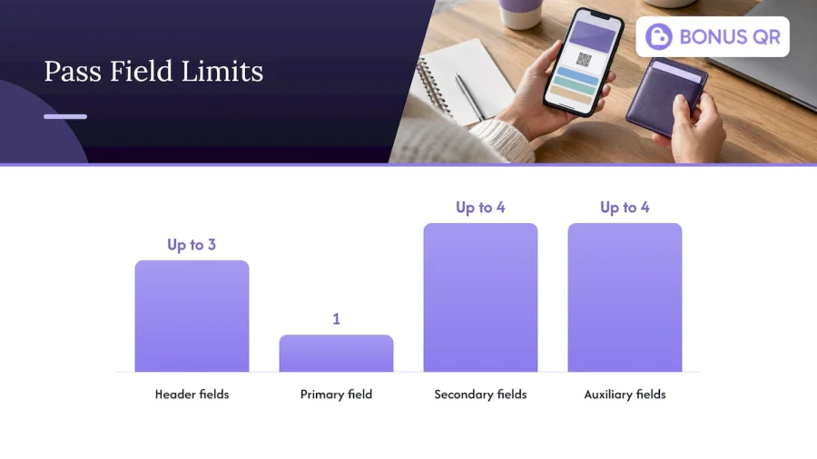
The same Apple documentation sets the structure of a pass. It can have up to three header fields, a single primary field, up to four secondary fields and up to four auxiliary fields. Coupons, store cards and generic passes with a square barcode can have up to four secondary and auxiliary fields combined.
The limit is a gift. You cannot cram everything in, so you have to choose. A practical allocation for a cafe stamp card:
| Field | What to put there | Example |
|---|---|---|
| Header | Short status the customer checks at a glance | “7/10” |
| Primary | The reward or the headline number | “3 stamps to a free coffee” |
| Secondary | Member name or tier | “Anna, Silver” |
| Auxiliary | Expiry or a current promo | “Double stamps on Tuesdays” |
| Back | Terms, address, opening hours, support contact | Full program rules |
If you are tempted to use every field, ask what a customer glancing at the screen with a coffee in the other hand would actually read.
Newer formats: poster-style passes
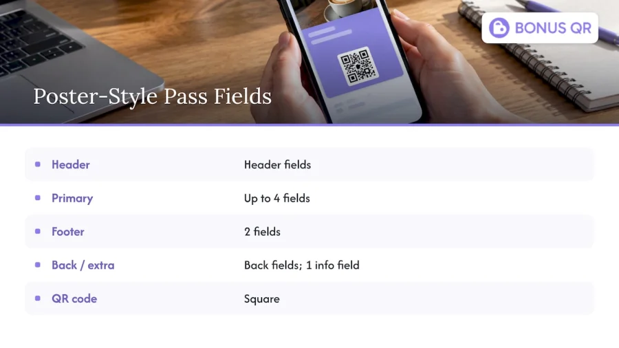
Apple’s documentation for iOS and watchOS 27 describes a poster-style generic pass for membership, loyalty, coupon, rewards and gift card passes. It is built to highlight prominent artwork, modern typography and thoughtful customer notifications. The layout has header fields, up to four primary fields, two footer fields, back fields and an additional info field, with a square QR code.
The lesson for design is the same as before, with more room for visual identity: one strong image, a few readable fields, a scannable code. If your brand has a photo or illustration customers recognize, such as a storefront, a signature dish or a mascot, this format gives it more space. Check Apple’s page for the current requirements before you commit, since the format is tied to the newest operating systems and not every customer will be on them yet. Keep a classic layout ready as the baseline.
Color, background and imagery
Apple’s guidance is to avoid a plain white background and to use a vivid solid color or a vibrant image instead. In practice that means choosing your brand’s main color for the pass background and picking text colors with strong contrast against it.
Some rules of thumb we use when helping businesses set up passes:
- One background color, one text color, one accent. More than that looks busy at pass size.
- Check contrast on a phone at low brightness. A pale pastel that looks elegant on a desktop monitor can disappear in a dim restaurant.
- Keep imagery simple. A strip image works best with one subject and no small details.
- Match your storefront. A customer who sees the same color on the sign, the cup and the pass connects them without thinking.
For general visual principles such as hierarchy, spacing and consistency, these content design principles translate well to a small pass.
Do not draw a plastic card
Apple’s guidelines also advise against reproducing the look of a physical item. A pass should follow the form and function of Wallet and be a clean, simple object, not a screenshot of a laminated card with a chip and a fake signature strip. Skeuomorphic touches take up space and make text harder to read.
Put text in fields, not in images
This is the most common design mistake. Apple advises using pass fields for text rather than embedding text in images, because not all images are displayed on all devices. The Apple Watch, for example, does not show strip and thumbnail images, so essential information inside them is lost. Google’s brand guidelines give another reason: text should not be embedded in the hero image because it cannot be localized.
If your reward message is in the artwork and the customer’s phone does not show the artwork, the message does not exist. Keep the artwork decorative and the information in fields.
Image specs for Google Wallet
Google publishes exact image requirements in its brand guidelines for offers and loyalty:
| Element | Requirement |
|---|---|
| Logo | Square PNG, at least 660×660 pixels |
| Logo margin | About 15% around the artwork, so Google’s automatic circular mask does not cut it off |
| Wide logo (optional) | 1280×400 pixels, a 16:5 ratio, supported for loyalty cards and other pass types |
| Hero image | PNG, 1032×812 pixels (about 5:4), with 20dp padding at the top and bottom |
Two practical consequences:
- Design the logo for a circle. If your logo is a wide wordmark, put it in a square with generous space, or use the wide logo option. Test how it looks cropped to a circle before uploading.
- Leave the top and bottom of the hero image empty of key content. The padding rule exists because those areas are covered or trimmed by other elements.
Apple’s equivalent assets are the icon, logo, strip and thumbnail images, each with its own size. Rather than memorizing dimensions, take them from Apple’s pass design documentation at the moment you build, since sizes and device support change with new releases.
If you are planning for Google specifically, our Google Wallet loyalty card guide covers the business side, and the Apple Wallet customer engagement guide covers the Apple side.
The QR code: the part that must work every time
A beautiful pass with a code that fails at the register is a failed pass. Apple’s documentation says passes can work with NFC readers and barcodes, and that Wallet supports QR, PDF417, Aztec, Code128, Code 39, Codabar, EAN-13 and Interleaved 2 of 5 barcode formats. Wallet also optimizes how a pass is presented to help the scan succeed. If you use NFC, the pass does not need a barcode.
For most small businesses, QR is the right choice. It is square, it holds enough data for a member ID or a unique reward token, and phone cameras and most modern scanners read it well.
Placement and size checklist
- Make it big. Do not shrink the code to fit a decorative layout. A larger code is easier to read from a cashier’s angle.
- Leave empty space around it. A clear border, often called the quiet zone, helps scanners find the edges of the code.
- Keep contrast high. Dark code on a light patch is the safest. Do not tint the code with brand colors that reduce contrast.
- Do not put it on a busy image. Patterns behind or inside the code cause misreads.
- Think about screens, not paper. A phone screen can have glare, sunlight and low brightness, and the same code that prints fine can struggle on glass.
- Match the scanner. Check which device reads your codes at the counter, and try your pass on that exact device. If you scan with a phone or tablet camera, you have fewer worries than with an older laser scanner.
Loyalty QR templates: where to start
Most businesses do not need to design from scratch. A template gives you a tested structure, and you change color, logo and wording. Choose a template by the type of reward you run:
| Program type | Front of the pass should lead with | Best for |
|---|---|---|
| Stamp card | Stamp progress and the next reward | Cafes, bakeries, barbers, car washes |
| Points | Points balance and distance to the next reward | Retail, restaurants, grocery stores |
| Tiered cashback | Cashback balance and current tier | Boutiques, wellness centers, hotels |
| Fixed discount | The discount and the member name | Service providers, gas stations |
| Coupon or promo | The offer and its expiry | Seasonal campaigns, onboarding offers |
A mobile wallet loyalty pass can also display tier status, key perks and links to manage rewards or shop. You do not need all of that on day one. Start with progress, QR code and one perk, then add as customers show they use it.
With BonusQR you can build digital stamp cards, points systems, tiered cashback and fixed discounts, then customize the brand look, with Apple and Google Wallet support. Our digital loyalty card guide for Google Wallet shows how those pieces fit together.
A step-by-step process for designing your pass
- Define the one goal. Repeat visits, higher spend or referrals. The goal decides which number goes in the primary field.
- Gather your assets. A square logo with room around it, a brand color, and one simple image if the format supports it.
- Write the fields first. Draft the text for header, primary, secondary and back fields before touching the visuals. If the message is clear in plain text, the design will be easier.
- Pick the layout. Use a stamp, points or cashback structure that matches the table above.
- Choose colors. A vivid brand background, high-contrast text, no plain white.
- Place the QR code. Large, with space around it, on a clean patch.
- Move the extras to the back. Terms, address, hours, support contact, social links.
- Preview on both platforms. A pass that looks good on iPhone can crop differently on Android.
- Test with the real scanner. Do this at your own counter, with real lighting.
- Launch and watch. See how many customers add the pass and come back.
How to test before customers see it
A short test routine catches most problems. Run it on at least one iPhone and one Android phone, using Apple Wallet and Google Wallet:
- Appearance. Is the logo cut off? Is any text hard to read at low brightness? Does the background clash with the text?
- Fields. Do the balance, tier and member ID show correctly? Do back-of-pass links open?
- Scanning. Can the cashier scan the code from a normal distance, in your shop’s lighting, with the phone at different brightness levels?
- Updates. After a purchase, does the balance change? When a customer reaches a reward threshold, does the pass reflect it?
- Edge cases. What does a new member with zero points see? What happens with an expired offer, or if the customer deletes the pass and adds it again?
Apple advises updating passes when appropriate to reflect real-world changes, and for a loyalty pass that is the whole point. A static pass is a card. An updated pass is a reason to open the phone.
Common wallet pass design mistakes
- Too many fields. The pass looks like a spreadsheet. Pick the few things customers act on.
- Reward message only in the image. It disappears on devices that do not show the image, and it cannot be localized.
- White or washed-out background. It blends with other passes and reduces contrast.
- Tiny QR code. Looks neat, scans badly.
- Logo clipped by a mask. Always leave margin and test the circular crop on Google Wallet.
- Copying a plastic card. It wastes space and adds nothing.
- Never updating. The pass shows stale information and customers stop checking it.
Our perspective
Small businesses tend to ask us about colors first. We understand why: the pass is a small billboard for the brand. But in our experience the design that matters most is the one that makes the next visit easier. A customer who sees clear progress and scans without friction has a reason to return.
That is why we build BonusQR around the loyalty engine behind the pass, not only the artwork. You choose a stamp card, points, cashback or discount, customize it to your brand, and the system handles rewards, customer insights and promotional notifications automatically. There is no POS integration to wait for, so a small team can launch quickly and refine the design as they learn.
Our advice is to start simple. One logo, one number, one QR code. Then use analytics to see what customers do and improve from there. A pass that is easy to understand will outperform a beautiful one nobody reads.
Michal Palus
Build your pass with BonusQR
If you want a branded wallet pass without a development project, start with the Free plan and move up as your program grows. Basic is €19 per month and Premium is €69 per month; see the BonusQR pricing page for what each plan includes.
Businesses that want a fully branded app can look at our white-label option: a one-off setup of €690 plus a €69 monthly subscription. For something more tailored, custom app development starts from €1500 one-off, with maintenance from €69 per month. For broader ideas on what to run once the pass is live, read about modern digital loyalty schemes.
FAQ
What is the best size for a wallet pass logo?
For Google Wallet, use a square PNG logo of at least 660×660 pixels, with about a 15% margin so the circular mask does not cut it off. A wide 1280×400 pixel logo is also supported for loyalty cards. For Apple, take the logo and icon sizes from Apple’s current pass documentation.
Should I put my reward text in the pass image?
No. Put it in pass fields. Apple advises against text in images because not all images appear on all devices, and Google says text in the hero image cannot be localized. Use the image for atmosphere and fields for information.
Which barcode format should a loyalty pass use?
QR is the usual choice for small businesses. Apple Wallet also supports PDF417, Aztec, Code128, Code 39, Codabar, EAN-13 and Interleaved 2 of 5. Choose the one your scanner reads, and test it at your counter.
Do I need a designer to create a loyalty pass?
Not necessarily. A template with your logo, brand color and clear fields covers most small businesses. A designer helps most with the logo artwork and any hero or poster imagery.
How often should I update a wallet pass?
Whenever something real changes: balance, tier, reward status or offer. Apple advises updating passes to reflect real-world changes. Seasonal promotions and special-occasion rewards are natural moments to refresh the message.


