Customer loyalty analysis turns purchase and sentiment data into a prioritised list of revenue risks and growth opportunities. It starts by measuring hard transactional metrics like retention rate and customer lifetime value (CLV), then layers on attitudinal data such as NPS, and finally tests whether that sentiment predicts real spending. Your first move: pull clean transaction data before you touch a single survey. A suitable loyalty platform can help you capture that baseline automatically.
TL;DR:
- Focusing on clean transaction data and consistent time windows is crucial before layering attitudinal scores to avoid misleading loyalty insights.
- Many programs underestimate the importance of active member rate, which directly influences engagement and the actual impact of reward tiers.
- Relying solely on redemption rates or high NPS scores can be deceptive without evaluating incremental margin and properly assessing causality through control tests.
- Combining cohort analysis, A/B testing, and uplift models helps identify which loyalty mechanics truly generate additional profit rather than just correlating with customer activity.
- Using integrated tools like Bonusqr supports rapid deployment and reliable data collection, helping small and mid-sized businesses make informed, profit-focused loyalty decisions.
What is customer loyalty analysis and which metrics matter most?
Customer loyalty analysis is the practice of measuring how strongly customers stick with your business, using both behavioural data (what they buy) and attitudinal data (what they say). The discipline runs on eight core metrics, and getting the formulas and cadence right matters more than the number of metrics you track.
Repeat purchase rate (RPR) tells you what share of customers bought more than once in a given period. The formula is: (Customers with 2+ purchases ÷ Total customers) × 100. Calculate it monthly for fast-moving retail, quarterly for considered purchases like furniture.
Customer retention rate (CRR) measures how many customers you kept over a period, expressed as: ((Customers at end of period − New customers acquired) ÷ Customers at start of period) × 100. This one belongs on a monthly or quarterly cadence, depending on your purchase cycle.
Customer lifetime value (CLV) estimates the total revenue you can expect from a customer relationship: Average order value × Purchase frequency × Customer lifespan. Recalculate it quarterly, since a stale CLV figure quietly distorts your acquisition spend decisions.
Average order value (AOV) is simply Total revenue ÷ Number of orders, tracked weekly or monthly to catch seasonal shifts early.
Churn rate is the inverse of retention: (Customers lost during period ÷ Customers at start of period) × 100. Watch this monthly. A rising churn rate is a leading indicator of trouble long before it shows up in revenue.
Reward redemption rate measures programme engagement: (Rewards redeemed ÷ Rewards earned) × 100. Low redemption often signals friction in the reward structure, not disinterest.
These metrics, along with formulas and cadence guidance, are laid out clearly in Shopify’s loyalty analytics breakdown, which remains one of the more thorough public references on the topic.
Then there are the three attitudinal metrics:
- Net Promoter Score (NPS) asks how likely a customer is to recommend you, on a 0 to 10 scale, and measures long-term advocacy. Its limitation: it captures intent, not behaviour, so a high NPS with flat repeat purchase rate is a warning sign, not a win.
- Customer Satisfaction Score (CSAT) measures happiness with a single transaction or interaction. It is a snapshot, not a trend, so use it after specific touchpoints rather than as a standalone health check.
- Customer Effort Score (CES) captures how easy it was to get something done, such as redeeming a reward or resolving an issue. Low effort correlates strongly with repeat behaviour, but CES alone won’t tell you why effort was high.
Of these, retention rate, churn, and reward redemption are lagging indicators. They tell you what already happened. Active engagement and NPS trend lines are your leading indicators, giving you an early read on where retention is headed next quarter.
How do you run a customer loyalty analysis step by step?
A loyalty analysis only produces trustworthy conclusions when you build it in the right order. Skipping data hygiene to get to the interesting sentiment work is the single most common way this goes wrong.
-
Clean your transaction data first. Deduplicate customer IDs, standardise timestamps, and merge records from any point-of-sale, e-commerce, or app source into one unified customer view. Loyalty programmes fail more often from messy identity resolution than from bad strategy.
-
Pick your time windows. Decide whether you’re analysing monthly, quarterly, or trailing 12-month cohorts, and keep that window consistent across every metric you calculate. Mixing windows is how teams accidentally compare apples to oranges without noticing.
-
Calculate your baseline revenue metrics. Run RPR, CRR, CLV, AOV, and churn on the clean dataset before you introduce anything attitudinal. This baseline is your ground truth.
-
Build behavioural cohorts. Group customers by acquisition month, first purchase category, or spend tier. Cohort analysis reveals whether loyalty is improving over time or whether older customers are simply better because they’ve survived longer.
-
Layer on attitudinal surveys. Append NPS, CSAT, and CES scores to individual customer records, not just as an aggregate score. You need the join key to work at account level, or step 6 becomes impossible.
-
Link sentiment to revenue. Join survey responses to transaction history and overlay them across your cohorts. Does a high NPS score actually predict a higher repeat purchase rate three months later? Correlation is a starting point; a proper causal test is the goal.
-
Run incrementality checks. Before crediting your loyalty programme with any lift, compare enrolled members against a matched control group or a holdout that was eligible but not exposed. Raw member-versus-non-member comparisons almost always overstate the effect, because your most loyal customers were likely to buy more anyway.
-
Prioritise by incremental margin, not gross revenue. Rank potential interventions (a new reward tier, a win-back campaign, a referral bonus) by the incremental margin they’re likely to generate, factoring in the cost of the reward itself.
Pro Tip: Don’t skip step 1 to get to the exciting sentiment analysis faster. Programmes that layer surveys onto messy transactional data end up debating survey semantics while the real problem, duplicate customer records or missing timestamps, sits unexamined in the baseline.
Building a loyalty KPI dashboard that diagnoses problems
A dashboard built only on activity metrics will tell you people are enrolled without ever telling you whether the programme creates real value. A better structure groups metrics into four domains, an approach BrandMovers’ loyalty dashboard framework sets out clearly.
Participation answers: how many customers are actually in the programme, and are they active?
- Enrollment rate (Enrolled customers ÷ Total customers)
- Active member rate (Members transacting in period ÷ Total enrolled members)
- Sign-up conversion rate at point of offer
Engagement answers: are members interacting with the mechanics you built?
- App or card open rate
- Push/email interaction rate
- Reward redemption rate
Retention & value answers: are members actually more valuable and more likely to stay?
- CRR and churn rate, split between members and non-members
- CLV differential between members and non-members
- Repeat purchase rate by cohort
Financial health answers: is the programme actually profitable once you account for reward costs?
- Incremental margin per member
- Cost of rewards issued vs. redeemed (liability)
- Margin-basis ROI, not revenue-multiple ROI
Of these, active member rate is the most telling upstream figure. Many programmes enrol large numbers of customers but see only a fraction transact regularly, and that gap explains most of the downstream weakness in engagement and retention. If your active rate sits low, fixing engagement mechanics matters more than adding new reward tiers.
Here’s a worked example. But your financial health domain shows a margin-basis ROI barely above break-even once reward liability is counted. The story: the programme works well for the small slice actually using it, but the low active rate caps its total impact, and reward costs are eating into what should be healthy margin.
What pitfalls distort customer loyalty analysis?
The biggest measurement mistakes aren’t calculation errors. They’re structural assumptions that quietly inflate how good your programme looks on paper.
- Selection bias. Loyalty members were often your best customers before they joined, so a raw comparison against non-members overstates the programme’s actual effect. Use matched-control groups or pre/post cohort comparisons on the same customers instead.
- Attribution errors. High redemption rate does not equal positive ROI. A member who redeems a £20 reward for a £22 purchase they’d have made anyway generates almost no incremental margin, despite looking like a success on a redemption report.
- Data hygiene gaps. Duplicate customer IDs, missing timestamps, and unmerged records across channels all corrupt your baseline before you’ve calculated a single metric. Run a validation pass, checking for duplicate emails or phone numbers, before trusting any output.
- Ignoring incrementality entirely. HBR’s analysis of loyalty mismanagement makes the case plainly: programmes that aren’t evaluated against actual profitability can quietly erode value while every top-line chart points up and to the right.
Pro Tip: When reporting results to leadership, always present incremental margin alongside any revenue multiple. A programme that shows “$6 returned per $1 spent” sounds impressive, but if that figure isn’t isolated from customers who’d have purchased anyway, it’s not a real ROI number.
Segmentation, cohort methods and proving causation
Averages hide the customers who matter most. Segmentation and cohort work are what separate a genuinely useful loyalty analysis from a vanity dashboard.
- Acquisition cohorts group customers by the month or channel they joined through, revealing whether newer cohorts retain better than older ones, a sign your onboarding or targeting has improved.
- Behavioural cohorts group by spend tier or purchase frequency, which is where luxury and high-value shopper segmentation becomes genuinely useful. Your top 10% of spenders often respond to entirely different loyalty triggers than your median customer.
- Matched-control and holdout designs are the gold standard for proving incrementality: you deliberately exclude a similar group of eligible customers from an offer, then compare outcomes against those who received it.
- A/B testing individual loyalty mechanics, such as a cashback tier against a point multiplier, tells you which reward structure actually changes behaviour rather than just correlating with it.
- Uplift models predict which specific customers will respond to an intervention, letting you target spend where it creates the most incremental margin rather than spraying rewards broadly.
- Survival analysis forecasts how long a customer relationship is likely to last given current behaviour patterns, useful for flagging churn risk before it shows up in a monthly report.
Each of these techniques should feed directly into a testable programme change, not sit in a slide deck. If a cohort of high-value shoppers is churning faster than average, that becomes a specific retention offer you test against a holdout, not a footnote.
What implementation lessons come from running a loyalty platform?
Start small: enable core transaction tracking and one attitudinal survey channel before adding gamified reward layers. Rapid launch, without needing full point-of-sale integration, lets you switch on active member rate, redemption tracking, and CLV calculations from day one. Push and email automation then handle the retention workflow: win-back triggers, milestone rewards, birthday offers, running on the behavioural data you’ve already captured. Test any new mechanic against a holdout before scaling it, and always check incremental margin, not just redemption volume, before calling it a success.
Real-world patterns in customer loyalty analysis
The clearest pattern across successful loyalty implementations is sequencing: businesses that get transactional data clean before layering on sentiment tracking consistently produce more reliable, actionable dashboards than those that launch surveys first.
The incremental lift was minimal. Once the business shifted its reward structure to reward the fifth visit within a rolling 30-day window rather than a flat tenth stamp, matched against a holdout group, the actual incremental visit rate rose measurably, a result that only became visible once cohort analysis replaced the raw redemption figure. A related data-driven loyalty approach in cafe environments shows how this kind of adjustment plays out in practice.
Retailers running tiered cashback programmes have found a similar pattern: the top spend tier, often under 5% of enrolled members, generates a disproportionate share of incremental margin, while the entry tier mostly rewards behaviour that would have happened anyway. That’s not a reason to cut the entry tier. It’s a reason to measure each tier’s incremental contribution separately rather than reporting one blended ROI figure across the whole programme.
Where does your loyalty data actually come from?
Loyalty analysis is only as good as the systems feeding it. Most businesses draw from four core sources: point-of-sale or e-commerce transaction logs, a loyalty platform’s own enrollment and redemption records, email or push notification engagement data, and survey responses collected at specific touchpoints.
Integration is where most of the real work happens. Transaction data typically needs a customer ID that matches across your POS system, your loyalty app, and any e-commerce platform, since a customer who shops in-store and online under two different email addresses will otherwise look like two separate people. A customer retention rate calculation only holds up once that identity resolution is solid.
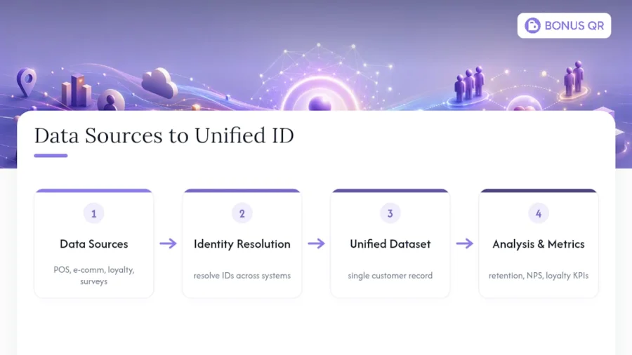
Survey data adds a second layer of complexity: an NPS score is only useful joined to a specific customer record, not floating as an anonymous aggregate. That means your survey tool needs to pass a customer identifier back into your central dataset, rather than living in a separate reporting silo.
For most small and mid-sized businesses, the pragmatic path is a loyalty platform that already unifies enrollment, transaction, and engagement data in one place, removing the need to build custom pipelines between systems that were never designed to talk to each other. Where a business runs multiple locations or channels, a unified customer ID strategy matters more than any single metric on the dashboard.
Which tools support customer loyalty analysis?
The right tool depends on how much of your data infrastructure already exists versus how much you need built for you.
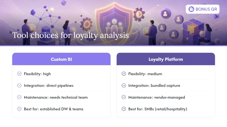
Businesses with an established data warehouse and analytics team often build custom dashboards using standard BI tools, pulling in transaction data, survey results, and engagement logs through direct integrations. This gives maximum flexibility but demands real technical investment to maintain.
Small and mid-sized businesses, particularly in retail, hospitality, and services, generally get more value from a loyalty platform that bundles data capture with built-in analytics. That means enrollment, transactions, redemptions, and push engagement all land in one system without a separate integration project for each. This matters because the biggest analysis failures usually stem from fragmented data, not from a missing statistical technique.
Whichever route you choose, the tool needs to support three things at minimum: clean customer identity matching across channels, cohort-level reporting rather than just aggregate totals, and the ability to append survey scores to individual customer records. A tool lacking any of those three will force you into manual spreadsheet work at exactly the step where errors creep in.
Turning loyalty analysis into strategic decisions
Numbers on a dashboard only matter once they change a decision. The translation from analysis to action usually runs through three questions.
First: where is the incremental margin actually coming from? If your financial health domain shows most profit concentrated in a small top-spend cohort, that’s a signal to protect and deepen that relationship, perhaps with a dedicated tier, rather than spreading budget evenly across all members.
Second: which leading indicators predict tomorrow’s churn? A falling active member rate or a declining CES score today should trigger a retention campaign now, not a post-mortem in next quarter’s board deck.
Third: does the data support scaling an intervention, or just running it longer? A successful pilot tested against a holdout group gives you permission to scale with confidence. A successful pilot with no control group gives you a hypothesis worth testing properly before you commit budget to it. As HBR’s research on retention economics shows, even modest retention improvements can produce outsized profit gains, which is exactly why the decision of where to invest matters more than the decision to invest at all.
The strategic value of disciplined loyalty measurement
The programmes that quietly lose money are rarely the ones with bad ideas. They’re the ones that never checked whether their best-looking metric was measuring anything real. A retailer once celebrated a strong revenue multiple for months before a proper cohort comparison showed most of that “return” was already-loyal customers who would have bought regardless.
Three things worth doing this quarter: audit your customer ID matching before trusting any dashboard, run one holdout test on your highest-cost reward mechanic, and report incremental margin alongside any revenue figure you show leadership. Discipline here protects profit long after the initial excitement about a new programme fades.
— Michal
How Bonusqr helps you put this into practice
Bonusqr is the practical route to running the analysis this article describes, without building custom data pipelines first. The platform gives you stamp cards, points, and tiered cashback alongside push notification automation, so you can launch a programme fast without needing point-of-sale integration, and start capturing clean transaction data from day one. Built-in analytics track active member rate, redemption, and CLV automatically, giving you the exact leading indicators this article covers without a separate reporting build.
It suits small and mid-sized retailers, cafés, gyms, and service businesses that need a working loyalty programme now, not a six-month data project. Hospitality operators can start with the hotel-specific loyalty setup, while service businesses have a dedicated application built for their model. If you’re ready to see clean, cohort-ready data from your first week live, register with Bonusqr and start your baseline measurement today.


