A café owner can spend an afternoon choosing colours, ordering a handsome stack of cards and training the team, only to discover that customers leave the cards at home. One regular earns nine stamps, can't remember whether the reward is a free drink or a discount, and never brings the card back. The programme exists, but the customer journey has broken without anyone noticing.
A useful loyalty card isn't decoration. It explains the reward, records progress and helps staff complete redemption without hesitation. That applies whether the business is a café, salon, gym or independent retailer. The practical difference comes from treating the card as an operational tool, then choosing print or digital delivery around the way customers return.
Why Loyalty Card Design Decides Your Programme's Fate
A customer joins at the till, pockets the card and returns days later. If the reward is unclear, the progress marks are hard to read or staff cannot confirm redemption quickly, that customer may stop using the programme. Good design prevents those small failures before they become normal behaviour.
A loyalty card has to work during a busy transaction, not just look attractive in a mock-up. It must explain the offer, show progress, identify the business and support a consistent action at the till, reception desk or treatment room. Print choices, scan zones and reward wording all affect whether customers use it.
The common failure is a broken sequence. A customer signs up, earns progress and then loses track of the next action. Faint stamps make progress difficult to check. Small-print conditions make the reward feel conditional. Different staff interpretations create friction precisely when the business should be rewarding loyalty.
Practical rule: A customer should understand what they earn, how they earn it and what they receive without needing a staff explanation.
Three jobs the card must perform
Explain the reward quickly. The offer should be readable in seconds, with the reward statement given more visual weight than secondary terms. Use customer-facing language, and make the completion point obvious. A card that requires a paragraph of explanation has already added work to the purchase.
Survive everyday use. A printed card will be bent, handled and carried among other cards. Its name, progress mechanic and key terms must remain readable after ordinary use. A digital pass has different constraints. It needs a recognisable name and icon so customers can find it on a phone without searching through an indistinct list.
Make redemption routine for staff. The mark, barcode or QR code should sit in a predictable area and remain usable under real counter lighting. Staff should not need to rotate the card, search for a code or debate whether a stamp counts. Test the scan zone with the devices and lighting used in the shop, then set one redemption rule that every employee can apply.
UK customers already understand common loyalty mechanics. A review reported in this overview of the UK loyalty programme landscape states that 97% of UK shoppers belong to at least one supermarket loyalty scheme, while the average shopper belongs to 3 supermarket loyalty schemes. A local programme therefore needs clear wording and a visible reward, rather than unfamiliar terminology or complicated conditions.
Treat the card as part of the operating process. Choose a mechanic that suits buying frequency, reserve enough space for accurate marks or scanning, and explain data use at signup. Those decisions will affect participation more than another decorative detail.
The Anatomy of a Well-Designed Loyalty Card
A customer should understand a loyalty card before reaching the till. The visual hierarchy needs to answer three questions in sequence: whose card is this, what do I receive and how do I progress? Any other element must support one of those answers or lose its place.
Give the business name and logo clear priority. Customers may see the card among several wallet passes, on a phone screen, or beside other counter promotions. Recognition has to work at a glance. State the reward in the customer's language, such as “Collect visits and receive a complimentary treatment”, rather than using an internal programme name.
Make progress easy to read without counting tiny symbols. Stamps, visit markers and points need enough separation for staff to mark or confirm them accurately. Similar shades, crowded rows and decorative patterns create hesitation at the counter.
Five design elements that earn a second look
Front-face hierarchy. Put the business name, reward and progress mechanic in a clear reading order. The offer should be understood before the customer studies the decoration or supporting copy.
A workable scan zone. A barcode or QR code needs enough visual space for staff to scan without rotating the card or searching for the mark. Use a calm surrounding area and keep nearby graphics from competing with the code. Scan reliability is part of the design, not a separate technical detail.
Readable type. Use strong contrast between text and background, avoid thin display fonts for instructions, and test the card at arm's length. If a customer must bring it close to their face, the hierarchy is doing too little work.
Controlled colour. Brand colours help recognition, but a dark background can make a progress marker disappear. Limit the palette and reserve the strongest accent for the reward or next action.
Minimal copy. Show the offer, the required action and any restriction that affects immediate use. Put full terms in the signup flow or linked information instead of shrinking them into a dense block.
Use this checklist before approving the artwork:
- Business identity: Name and logo that remain clear at a glance.
- Reward statement: One direct sentence describing the benefit.
- Progress mechanic: Stamps, points, visits or a spend threshold.
- Action prompt: A short instruction such as “Show this card at checkout”.
- Code or identifier: Easy to locate and use.
- Essential terms: Only information customers need before using the reward.
Personal relevance can improve recognition when it serves the customer rather than crowding the card. Guidance on customer loyalty personalization explains how customized rewards and messages can remain useful without turning the design into a customer profile. Businesses reviewing the offer and layout can also use these essential loyalty rewards card tips as a practical check.
Designing Your Loyalty Card Step by Step
Start by choosing the reward mechanic. Use stamps for repeat purchases with a similar value, such as coffees or smoothies. Points suit changing basket values, while visit thresholds can work for salons and gyms. Cashback and spend-based rewards require a balance that customers can understand quickly.
Once the mechanic is set, map the workflow around it. Decide who records progress, where that happens, what staff must verify and how the customer sees the reward. A stamp card needs a completion point. A points programme needs a current balance and a clear conversion rule. Tiers need status cues that do not distract from the next achievable reward.
Choose the format around the customer's routine
A wallet-sized card fits businesses where customers already carry cards and staff mark or scan them at a fixed counter. A smaller counter card can support stamping, provided its stock withstands repeated handling. A digital pass fits customers who use their phones during checkout, booking or entry.
Choose the physical dimensions only after defining the operational action. The code, progress area and reward statement need sufficient space alongside the brand identity. For UK production, prepare 300dpi or higher artwork, CMYK colour setup and 3mm bleed on all sides, following these loyalty-card production specifications. Keep text and codes within the safe area, away from the trim.
Write only what the customer needs
Use the hierarchy defined above to draft a short front:
- Reward sentence: “Collect visits and receive a complimentary service.”
- Action sentence: “Show this card before payment.”
Place exclusions, expiry details and qualifying-purchase rules behind the card or in the signup flow. A crowded front makes the reward harder to spot and gives policy more visual weight than the offer.
Test the handover, not just the artwork. Give the draft to someone unfamiliar with the programme and ask:
- What reward does this card offer?
- What must the customer do to earn progress?
- What should staff scan, stamp or check?
Use the scan zone and legibility standards established in the previous section, then test the complete transaction in the actual setting. Run a live redemption with the least experienced team member. Watch for code-searching, card rotation, uncertain wording and delays. Check that the customer can move from signup to first recorded action without staff improvising instructions.
The final proof should include the card, customer signup, staff action and reward confirmation. A static design review will not reveal whether the counter process works.
A low-contrast progress marker, tiny identifier or long condition block can seem minor during approval. Together, they make the programme feel unreliable. Fix those defects before production, then repeat the handover test after any change to the mechanic, copy or artwork.
Print Versus Digital Loyalty Card Design
Print and digital cards solve different problems. A printed card feels tangible and can be handed over without asking for an email address or phone number. It can work well for a small café where the same staff member stamps cards at a familiar counter.
The weaknesses are equally practical. Customers lose cards, forget them and arrive without them. When the reward rules or branding change, existing stock can't update itself. A physical card also gives the business little visibility into who returns, which rewards are redeemed or where the process stalls.
Digital cards stay available on the customer's phone and can be updated without a reprint. They can support wallet passes, personal identifiers and analytics, but the signup flow needs careful privacy communication. A digital option isn't automatically better if customers don't understand how to access it or staff can't explain the first scan.
| Criterion | Print Card | Digital Card |
|---|---|---|
| Cost to update | Requires revised artwork and new production | Changes can be applied to the live pass |
| Customer data | A stamp or mark may identify no customer | Signup and scans can support an identifiable profile, subject to consent and compliance |
| Redemption speed | Fast when the stamp or code is obvious | Fast when the pass and scan flow are familiar |
| Hardware needed | Pen, stamp or scanner depending on the mechanic | Phone-based scanning can avoid extra till hardware |
| Customer visibility | Depends on the card staying in the wallet | Available through a phone wallet or mobile access |
| Operational risk | Loss, damage and illegible marks | Poor connectivity, unfamiliar signup or a weak scan flow |
A QR-based platform such as BonusQR can let staff scan and redeem within an app while customers keep passes in Google Wallet or Apple Wallet. It supports stamps, points, cashback, visit and spend thresholds, fixed discounts and welcome bonuses, with ready-to-print materials for businesses that still want a physical sign-up prompt. The relevant choice isn't print versus digital as a matter of fashion. It's whether the chosen format removes more friction than it introduces.
Businesses comparing wallet-based approaches can use this guide to digital customer loyalty cards to assess the customer and staff journey before committing to a format.
Loyalty Card Design Ideas by Business Type
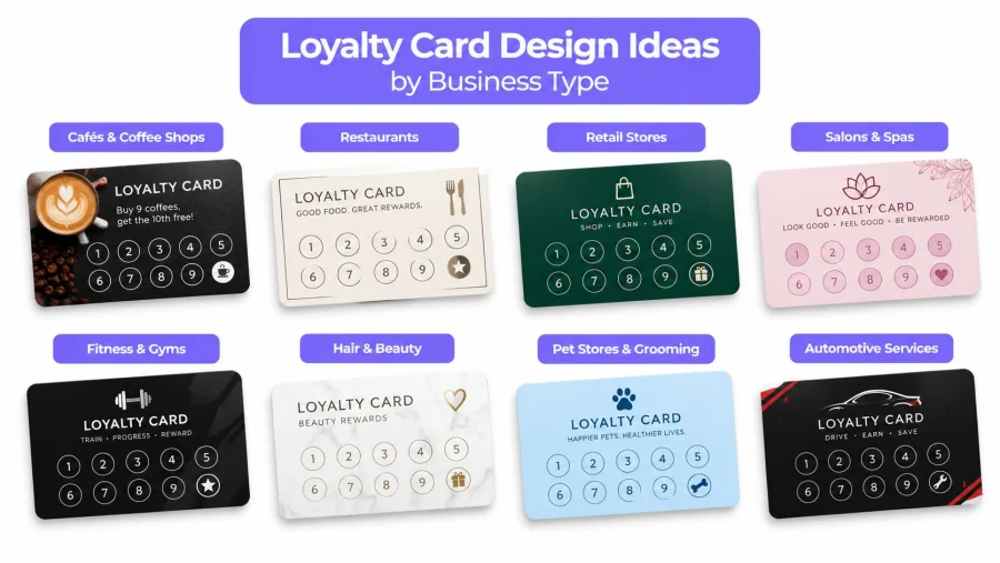
A good mechanic reflects the rhythm of the business. A café may see frequent, low-value visits, while a salon sees fewer appointments with a higher emotional and financial commitment. Copy, progress markers and colour should make that pattern immediately recognisable.
Cafés
A familiar buy-nine-get-one-free structure is easy to explain when the card shows nine earned spaces and a clearly marked reward space. The front can place a warm product illustration or café colour behind the logo, with the progress grid below and the reward in a prominent panel.
The design detail that matters most is the count. Customers should see how many visits remain without counting cramped marks. A digital version can keep the same visual rhythm while removing the problem of a forgotten card at home.
Salons and wellness businesses
A salon often benefits from visit milestones rather than a simple coffee-style stamp sequence. The card might show an initial reward, a service upgrade and a premium treatment, with each milestone labelled in plain language.
The layout should feel calm and spacious. Use a restrained palette, generous margins and appointment-friendly prompts such as “Show at your next visit”. A reminder linked to an appointment can be more useful than a loud promotional banner.
Gyms and fitness studios
Attendance streaks and visit thresholds need a bold progress display. A phone-friendly card can use a strong numeral, a simple row of activity markers and a motivational line that remains readable when viewed quickly or shown as a screenshot.
The design should prioritise recognition at reception. Avoid delicate details that disappear on a small screen or under bright lighting. The member needs to know whether the latest visit counted and what the next milestone provides.
Retailers and grocery shops
Retail customers already understand points, member pricing and discounts. The UK government review of loyalty pricing describes a setting where supermarket loyalty schemes are highly familiar, so an independent retailer should avoid inventing complicated language. Explain how spend converts to points, or show the member price directly where that is the primary benefit.
A retailer's layout can place the brand and member benefit at the top, with the points balance or offer area beneath. Seasonal offers can change, but the core structure should stay recognisable. More examples of sector-specific layouts are available in these loyalty card examples.
The same principle applies across all four sectors: the card should mirror the customer's normal action. A café counts visits, a salon recognises appointments, a gym records attendance and a retailer connects spending with a benefit.
Accessibility and Compliance in Loyalty Card Design
Accessibility starts with the customer who isn't standing in ideal lighting with perfect eyesight and a steady phone. Low-contrast text, thin progress lines and decorative fonts can exclude people before staff realise there's a problem.
Use clear contrast between foreground and background, keep instructions short and test type at a realistic viewing distance. Don't rely on colour alone to show progress. A completed marker should also use a shape, label or distinct pattern so customers with colour-vision differences can follow it.
QR codes need a quiet area around them and enough visual clarity for a customer to position a phone without repeated attempts. Staff should have an alternative identification or assistance process when scanning isn't practical. Accessibility isn't only a visual concern. It includes the time and confidence required to complete the action.
Data collection belongs in the design
A loyalty signup commonly involves personal data. The ICO's public guidance on loyalty cards explains that customers may share where they shop, how much they typically spend and what they like to buy, while organisations hold substantial customer information that must be kept secure.
If the programme collects a name, email address, phone number or customer ID, it processes personal data. The signup flow needs a privacy notice explaining what data is collected, why it is needed and how it will be used. UK GDPR guidance also highlights purpose limitation, storage periods and data security as core considerations, as described in this UK loyalty compliance guidance.
Compliance belongs beside the reward decision, not after launch. The collection screen, consent wording, retention approach and access controls should be designed before customer data starts arriving.
Make the card and signup agree
A card that promises a simple stamp reward shouldn't lead to a signup form asking for unnecessary information. The requested data should match the stated purpose. If marketing messages are optional, the customer should be able to understand that choice rather than treating it as a hidden condition of receiving the reward.
Keep the public-facing card concise, but make the linked privacy information easy to reach. This prevents a later retrofit that changes the signup journey, customer communications and staff script at the same time.
Launch Your Card the Simple Way
A finished design should pass four checks before it reaches customers:
- Legible reward: The benefit is clear in seconds.
- Scannable action: The code or progress area works in real conditions.
- Recognisable brand: The card looks like the business customers already know.
- Compliant signup: The privacy notice explains data collection, purpose and use.
A QR-based service can reduce the production decisions that make physical cards difficult to maintain. BonusQR lets businesses configure stamps, points, cashback, visit and spend thresholds, discounts and welcome bonuses, then provide phone-based access and ready-to-print promotional materials without POS integration or extra hardware. Its setup also includes GDPR-safe data handling and reporting features for customer and reward activity.
The important part is not choosing the most elaborate mechanic. It's launching a card that staff can operate consistently and customers can understand immediately.
Launch checklist: Reward first. Progress visible. Code tested. Contrast checked. Privacy notice linked. Staff redemption rehearsed.
Businesses ready to move from artwork to a working programme can create their first loyalty card with BonusQR, test the scan and redemption flow in the shop, and invite customers to join while the offer is still fresh. A simple card that gets used will outperform a beautiful card customers can't find, read or redeem.


